I am going to be evaluating my photography assinment. I will be looking at my photo shoot ressarch and editing.
First of all we had to ressarch "Film Noir" to find out what kind of style and conventions they used to make. During my ressarch i found out that they use very cartoony styled photos and fun text for most posters but the one that used realy photos normally were very dark and didn't have the whole face and normally have a small bit in colour like red lip stick or something along those lines. Also in my reesarch i saw that all flim posters include a info point were they name all main contruibuters in a blur which in normally quite small but still big enough to see.
Our photo shoot went very well because we all worked to gether very fast and we kept pitching different idea to each other and we listened and finally got some very good photos to use for our posters. We planned our shoot very well and had our props and costums with use and we even had our lighting sorted with a few minutes of getting into the studio. I think we probly could have done a couple of different ideas for our shoot but we were set on doing a kidnapped styled poster so we stuck to that set. This gave our poster a more
"Noir" feel by using a little darkness and and a moody style set up it seems to have created a very "film noir"ish poster. We did decide to use two people in most of our shoot because it seemed to work because we wanted to have the unknown aspect of the story and the main point on the poster to give a slight level of confusion.
In editing at first i couldn't seem to get the right idea of how to create my own poster and i seemed to keep making more horror film styled than film noir but after a while i got the hang of it and was able to get a very nice poster that i think get the idea of our film accros. I decided to use two different people for my final poster because it seemed to be the right way to get the message about our film across which was that i am the antagoist in our film and joe was the protagonist. We mainly put the message acros by placing him lower than me and also placing the light so it was barly making him visable. and placeing more light on me to draw the audiences eye towards me. I decided to use a portrait layout because my idea used mostly vertical aspects reather than side-by-side because i like using the effect when placing people high than others gives the idea of power and controlle.
Overall i think that i did very well and have created a very good poster.
Monday, 19 December 2011

Wednesday, 14 December 2011

Wednesday, 7 December 2011


Friday, 2 December 2011
Picture Publicity
Mark Fairhurst
Mark started out in the 70's working for "Derek Berwin" the famous underwater fashion photographer along side running a in-house studio in london for and advertisment company. Mark seem to really enjoy his work because he takes his time and for example his portrait of Zara Phillips was taken in a cafe at a race course.
Mark seems to like to do more portrait styled photography with the subject looking away from the camera but he also does some action shots.
He work is regulary used in the uks top "Country" magazines but also does photography of most profecions like chef and sportsman.
Mark he even work with world famous people like her majesty the queen.
i got all my infomation for this site: http://www.markfairhurstphotographer.com/
These are some examples of his work:
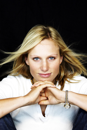
This photo seems to use 3 point lighting from behind the camera all faceing the subject to keep her lit well. The photo seems to be quite personal because you cant really see anything apart from the subject and a little of the backdrop which gives it a kind of personal feel.

This photo is more of an action shot but could be said to be personall because he is using all natural light to capture lance doing what he does best. Even tho there are a few other people in the photo your eye is still artacted to lance due to the fact that he has been placed right in the middle of the photo.

This again is a very personall portrait which seems to be marks favrouite style but in this photo it gives an almost interlectuall feel about the subject due to his expersion and the way he is just looking into the camera.
i got my infomation form this site: http://www.usefilm.com/photographer/70454.html
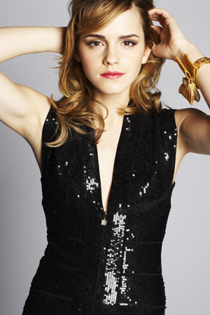
This photo give a more glamorous feel to the subject because of the postion he has place Emma along with the outfit which can give the audience a fell of weither amdmiring or jolousy. The lighting in this photo seems to be key point lighting to give the whole subject light making her completly visable.

Mark started out in the 70's working for "Derek Berwin" the famous underwater fashion photographer along side running a in-house studio in london for and advertisment company. Mark seem to really enjoy his work because he takes his time and for example his portrait of Zara Phillips was taken in a cafe at a race course.
Mark seems to like to do more portrait styled photography with the subject looking away from the camera but he also does some action shots.
He work is regulary used in the uks top "Country" magazines but also does photography of most profecions like chef and sportsman.
Mark he even work with world famous people like her majesty the queen.
i got all my infomation for this site: http://www.markfairhurstphotographer.com/
These are some examples of his work:
This photo seems to use 3 point lighting from behind the camera all faceing the subject to keep her lit well. The photo seems to be quite personal because you cant really see anything apart from the subject and a little of the backdrop which gives it a kind of personal feel.
This photo is more of an action shot but could be said to be personall because he is using all natural light to capture lance doing what he does best. Even tho there are a few other people in the photo your eye is still artacted to lance due to the fact that he has been placed right in the middle of the photo.
This again is a very personall portrait which seems to be marks favrouite style but in this photo it gives an almost interlectuall feel about the subject due to his expersion and the way he is just looking into the camera.
Sean Cook
Sean started out as a fashion photographer but over time has become a very reviered name and has been hired to work with some of the biggest names in showbiz and politics for inctance actors like Emma Watson and Tony Blair
Sean like to do more interesting work for instance he has done a photo of tommy hans but it is blured out which gives it a strange and confusing feel.
Sean has worked for some big magazines like FHM, live and you along with that some of his work is now perminetly on show in London's National Portrait Gallery.
His work has also made him on of the worlds must reviered fashion photographers and has worked all over the world from the UK to the USA and many more...
Here are some exaples of his work.....
Sean like to do more interesting work for instance he has done a photo of tommy hans but it is blured out which gives it a strange and confusing feel.
Sean has worked for some big magazines like FHM, live and you along with that some of his work is now perminetly on show in London's National Portrait Gallery.
His work has also made him on of the worlds must reviered fashion photographers and has worked all over the world from the UK to the USA and many more...
Here are some exaples of his work.....
i got my infomation form this site: http://www.usefilm.com/photographer/70454.html
This photo give a more glamorous feel to the subject because of the postion he has place Emma along with the outfit which can give the audience a fell of weither amdmiring or jolousy. The lighting in this photo seems to be key point lighting to give the whole subject light making her completly visable.
This photo is more of a moment capture because it seems to be as if the subject is just talk to the camera and is just standing and being caual which can make the photo very easy to the audience. The lighting in this photo seems to be very one side mainly from in front of the subject which give the photo more of a natural feel
Saturday, 26 November 2011
Movie Poster Work!
This is the poster for the horror film "The Descent" which is about 6 girls that go cave diving but find something other than mushroom in the cave. At first it looks like the main girl is just trying to get out of a whole but after looking more closly you can see that it is in the shape of a skull and that it is made up of the 6 girls, This could give the idea that the film isnt so pleasent feel becaus eit instantlly give the feel of death so this will,tell the audience that it will consist of these girls dying.The target audience for this film poster would be anyone reallyt who enjoys horror films because it contains four of the most basic horror styles, its dark which gives it an ominous feel , the characture looks like they are in pain which is always a good thing in a horror film .Plus the text on the poster is very smart because it has been done so that it creates a boarder around the edge while using a very bold sinple font.
 This is the film poster for the film "The Dark Knight"which is a qction thriller film that was realeesed in summer 2008. This poster is a very simple one because the whole background is blured out and so is most of what seems to be the mosgt important part of the poster which is the famouse batman characture "the joker" but he has been slightly bured out apart for his hands. Also the have used his famous saying from the film "Why So Serious?" but they have made it sem it has been writtin in blood, this cause give the affect that he is a protagonist of the film who is murderous and probably mad. Along side with that they have used some blood to creat his smile over the top which can ook a little bit creepy which again can give him the more protagonist feel.
This poster would seem to be directed to the more older audience due to the more horror styled layout, it seems that this would give the audience the idea that the film will be very dark and have quite an evil motife. The text on this poster devided into two peices the main part of the text which is the tittle of the film and the release date which are in red or white simple text all in capitles and the other half which is written in blood and is slightly smudged which gives it a slightly more mad feel.
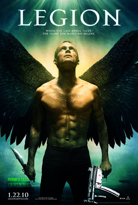
This is the film poster for "Legion" which is a thriller film about one lone angel that tryies to save mankind because the rest of them are trying to kill a certwin few that in turn will be the fall of mankind. This poster is very smart because it plays on what most people would call an angel because the most likly idea of the angels is that they are dressed in white with white wings and a halo and does not fight, but this angel is in black jeans with black wings tattoos all over his body and to give the feel he is ready for a might he has an MP5HK in one and and a stange looking knife in the other this give the feel that he is not a ordenary angel. They also have made it loom like he is in a spot light coming down from heave which could mean that god is looking at him or saying he has done something, along side that there is also almost no background just the diner in one corner and a garage in the other which give it the feel on suclusion. This poster seems to be more leaned towards relgious people becasue it use a halo light and an angel which can give it an angelic feel but since he has black wings and a couple wepons gives it a weird feel which can compleetly change how people see the poster. The text on this poster is very sinple because it only uses a basic font and only is in two sizes a very large point for the tittle and smalle for the slug line and date and blur.
In this image the first thing that draws attention is the large red rose with what seems to be small thorns inside the petals, this seems to be a almost a visual metaphor for the film’s main character. This poster only has two different shots one of the main actor which is a long shot of her which is then imposed onto the rose which is a close up with the thorns edited in the petals. At first the poster could be misleading but if you look close you can see a small pool of blood under the rose and there are thorns inside the rose which makes it seem more like a horror. This image has a very controlled and almost trickster impact because it uses very underline visual techniques to enable this poster to give one idea then completely change what the viewer sees.

n this poster the eye is first drawn to the “Mad Hatter” (aka Johnny Depp) due to the fact that he has bright orange hair and is wearing quite weird clothes, although this is the first thing you look at it could also be the large mushrooms that surround him which would be a very funny factor because most people think them o be very small which would add a humours factor to the viewer. This poster is just one shot of the mad hatter walking through the mushrooms with the white castle in the background which will make people focus on the background so they can try to figure out what it is. The poster gives away the fact that the film is a fantasy very easily but since this film is mainly directed to smaller children it works because they may not be the smartest people so the easier it is the more likely they are going to like the look and want to go and watch it. The overall impact of the image is pretty much just fun, happy and wacky which fits the film very well so in retrospect it does make people see what the film will be so all in all it give the correct impact showing people what they will see.
Friday, 11 February 2011
Thursday, 10 February 2011
Mini Assinment
Brief History of TV in the UK and abroad
The idea of television was only started around the 1870s, but it became a reality until the 1920s. invented the television because scientists all over the world invented different components that come together to make a TV work . Vladimir K. Zworykin, John Logie Baird, Philo Farnsworth all worked together on making the TV. By 1928 engineers had managed to create a receiver set and camera, and this went on show at the World's Fair - the first public viewing of television. However, the opportunities presented by TV were clear to many before this, and both the BBC and CBS were established in 1927.
Cameras Have evolved a lot since the start of TV for instance old film reels that were just hundreds of small pictures which has evolved into just data which we use mostly now which is usually stored on SD cards which then cam be transferred onto a pc then can be edited but also can be copied so back ups can be made making it less of a set back if one set of data is lost, so a copy can be used in its place. The way video is recorded has changed a lot as well, Instead of just one kind of format not there are many. The main formats are STANDED, HD (High-Definition) and Blue-ray which are all well know to most people but a lot of people don't know the differences between them.
Different countries use different broadcasting standards NTSC, PAL and SECAM . NTSC (National Television System Committee) was the first analogue TV system but it is mainly an American used system which was created in the 1940s. PAL (Phase alternating line) which is the second system which is mainly used in Europe. SECAM (Sequential Colour with Memory) which used by countries such as Russia
How has the digital world changed the way we consume and create TV?
Before you could only watch TV on a proper TV set but as time has gone on it have developed into other sources. Most people still watch TV sets but you can now watch it on you phones computers and even buy mini TVs so now you can watch any station anywhere. When TV first started you had to watch what was on at the time so if you wanted to watch a show you had to be at a TV set at a certain time but where as now you can just use on demand TV which means you can watch anything any time making TV much more time friendly.
Digital TV cameras are far more superior to video cameras because they don't use light sensitive paper which can be ruined if open at the wrong time which can ruin the entire film where as digital data can be recoved or if some or it is corrupted only a small bit will be ruined. Size is also aided by digital cameras because tapes are not used where in its stead memory units are used such as SD cards.
Editing has changed drastically due to the fact that now it is all done on computers so that instead of the reels being edited now the data files are combined and are almost like layered on top of each other. The things that can be done with editing has changed as well like now you can edit peoples eye colour even skin tone so you can completely change a persons appearance, the background can also be changed for instance using a green screen or some use a blue screen, by using this they can extract certain characters or props and then insert them onto another picture.
Have online videos lowered the standards of television production?
Youtube is the biggest video sharing website on the internet and some would argue that because of this and the fact that people can make home movies with any recording equipment such as a mobile phone or a mini DV camera. It must be very hard for some directors now because the public can get hold of top-of-the-line equipment so they have to be very creative to make films different to the things that normal people make. Some directors embrace the home movie idea and have created entire films made in that style, For instance the film “Paranormal Activity” is made all by one camera which is notified and controlled by one of the main characters, This technique is normally used for Horror film and TV. The way things are edited is not so different with domestic and pro use because anybody can get hold of the software and all the difference is just a good imagination and pro use of the programme, Equipment is the same anyone can obtain it be it take a pro to use it correctly.
Subscribe to:
Posts (Atom)