This is the poster for the horror film "The Descent" which is about 6 girls that go cave diving but find something other than mushroom in the cave. At first it looks like the main girl is just trying to get out of a whole but after looking more closly you can see that it is in the shape of a skull and that it is made up of the 6 girls, This could give the idea that the film isnt so pleasent feel becaus eit instantlly give the feel of death so this will,tell the audience that it will consist of these girls dying.The target audience for this film poster would be anyone reallyt who enjoys horror films because it contains four of the most basic horror styles, its dark which gives it an ominous feel , the characture looks like they are in pain which is always a good thing in a horror film .Plus the text on the poster is very smart because it has been done so that it creates a boarder around the edge while using a very bold sinple font.
 This is the film poster for the film "The Dark Knight"which is a qction thriller film that was realeesed in summer 2008. This poster is a very simple one because the whole background is blured out and so is most of what seems to be the mosgt important part of the poster which is the famouse batman characture "the joker" but he has been slightly bured out apart for his hands. Also the have used his famous saying from the film "Why So Serious?" but they have made it sem it has been writtin in blood, this cause give the affect that he is a protagonist of the film who is murderous and probably mad. Along side with that they have used some blood to creat his smile over the top which can ook a little bit creepy which again can give him the more protagonist feel.
This poster would seem to be directed to the more older audience due to the more horror styled layout, it seems that this would give the audience the idea that the film will be very dark and have quite an evil motife. The text on this poster devided into two peices the main part of the text which is the tittle of the film and the release date which are in red or white simple text all in capitles and the other half which is written in blood and is slightly smudged which gives it a slightly more mad feel.
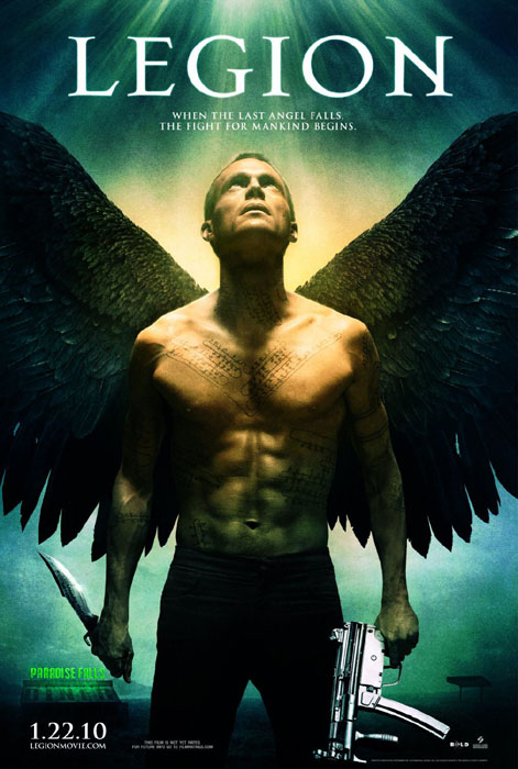
This is the film poster for "Legion" which is a thriller film about one lone angel that tryies to save mankind because the rest of them are trying to kill a certwin few that in turn will be the fall of mankind. This poster is very smart because it plays on what most people would call an angel because the most likly idea of the angels is that they are dressed in white with white wings and a halo and does not fight, but this angel is in black jeans with black wings tattoos all over his body and to give the feel he is ready for a might he has an MP5HK in one and and a stange looking knife in the other this give the feel that he is not a ordenary angel. They also have made it loom like he is in a spot light coming down from heave which could mean that god is looking at him or saying he has done something, along side that there is also almost no background just the diner in one corner and a garage in the other which give it the feel on suclusion. This poster seems to be more leaned towards relgious people becasue it use a halo light and an angel which can give it an angelic feel but since he has black wings and a couple wepons gives it a weird feel which can compleetly change how people see the poster. The text on this poster is very sinple because it only uses a basic font and only is in two sizes a very large point for the tittle and smalle for the slug line and date and blur.
In this image the first thing that draws attention is the large red rose with what seems to be small thorns inside the petals, this seems to be a almost a visual metaphor for the film’s main character. This poster only has two different shots one of the main actor which is a long shot of her which is then imposed onto the rose which is a close up with the thorns edited in the petals. At first the poster could be misleading but if you look close you can see a small pool of blood under the rose and there are thorns inside the rose which makes it seem more like a horror. This image has a very controlled and almost trickster impact because it uses very underline visual techniques to enable this poster to give one idea then completely change what the viewer sees.

n this poster the eye is first drawn to the “Mad Hatter” (aka Johnny Depp) due to the fact that he has bright orange hair and is wearing quite weird clothes, although this is the first thing you look at it could also be the large mushrooms that surround him which would be a very funny factor because most people think them o be very small which would add a humours factor to the viewer. This poster is just one shot of the mad hatter walking through the mushrooms with the white castle in the background which will make people focus on the background so they can try to figure out what it is. The poster gives away the fact that the film is a fantasy very easily but since this film is mainly directed to smaller children it works because they may not be the smartest people so the easier it is the more likely they are going to like the look and want to go and watch it. The overall impact of the image is pretty much just fun, happy and wacky which fits the film very well so in retrospect it does make people see what the film will be so all in all it give the correct impact showing people what they will see.
