I am going to be evaluating my photography assinment. I will be looking at my photo shoot ressarch and editing.
First of all we had to ressarch "Film Noir" to find out what kind of style and conventions they used to make. During my ressarch i found out that they use very cartoony styled photos and fun text for most posters but the one that used realy photos normally were very dark and didn't have the whole face and normally have a small bit in colour like red lip stick or something along those lines. Also in my reesarch i saw that all flim posters include a info point were they name all main contruibuters in a blur which in normally quite small but still big enough to see.
Our photo shoot went very well because we all worked to gether very fast and we kept pitching different idea to each other and we listened and finally got some very good photos to use for our posters. We planned our shoot very well and had our props and costums with use and we even had our lighting sorted with a few minutes of getting into the studio. I think we probly could have done a couple of different ideas for our shoot but we were set on doing a kidnapped styled poster so we stuck to that set. This gave our poster a more
"Noir" feel by using a little darkness and and a moody style set up it seems to have created a very "film noir"ish poster. We did decide to use two people in most of our shoot because it seemed to work because we wanted to have the unknown aspect of the story and the main point on the poster to give a slight level of confusion.
In editing at first i couldn't seem to get the right idea of how to create my own poster and i seemed to keep making more horror film styled than film noir but after a while i got the hang of it and was able to get a very nice poster that i think get the idea of our film accros. I decided to use two different people for my final poster because it seemed to be the right way to get the message about our film across which was that i am the antagoist in our film and joe was the protagonist. We mainly put the message acros by placing him lower than me and also placing the light so it was barly making him visable. and placeing more light on me to draw the audiences eye towards me. I decided to use a portrait layout because my idea used mostly vertical aspects reather than side-by-side because i like using the effect when placing people high than others gives the idea of power and controlle.
Overall i think that i did very well and have created a very good poster.
Monday, 19 December 2011

Wednesday, 14 December 2011

Wednesday, 7 December 2011


Friday, 2 December 2011
Picture Publicity
Mark Fairhurst
Mark started out in the 70's working for "Derek Berwin" the famous underwater fashion photographer along side running a in-house studio in london for and advertisment company. Mark seem to really enjoy his work because he takes his time and for example his portrait of Zara Phillips was taken in a cafe at a race course.
Mark seems to like to do more portrait styled photography with the subject looking away from the camera but he also does some action shots.
He work is regulary used in the uks top "Country" magazines but also does photography of most profecions like chef and sportsman.
Mark he even work with world famous people like her majesty the queen.
i got all my infomation for this site: http://www.markfairhurstphotographer.com/
These are some examples of his work:
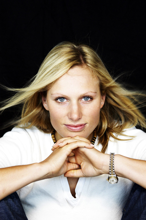
This photo seems to use 3 point lighting from behind the camera all faceing the subject to keep her lit well. The photo seems to be quite personal because you cant really see anything apart from the subject and a little of the backdrop which gives it a kind of personal feel.

This photo is more of an action shot but could be said to be personall because he is using all natural light to capture lance doing what he does best. Even tho there are a few other people in the photo your eye is still artacted to lance due to the fact that he has been placed right in the middle of the photo.

This again is a very personall portrait which seems to be marks favrouite style but in this photo it gives an almost interlectuall feel about the subject due to his expersion and the way he is just looking into the camera.
i got my infomation form this site: http://www.usefilm.com/photographer/70454.html
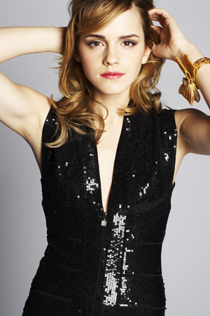
This photo give a more glamorous feel to the subject because of the postion he has place Emma along with the outfit which can give the audience a fell of weither amdmiring or jolousy. The lighting in this photo seems to be key point lighting to give the whole subject light making her completly visable.

Mark started out in the 70's working for "Derek Berwin" the famous underwater fashion photographer along side running a in-house studio in london for and advertisment company. Mark seem to really enjoy his work because he takes his time and for example his portrait of Zara Phillips was taken in a cafe at a race course.
Mark seems to like to do more portrait styled photography with the subject looking away from the camera but he also does some action shots.
He work is regulary used in the uks top "Country" magazines but also does photography of most profecions like chef and sportsman.
Mark he even work with world famous people like her majesty the queen.
i got all my infomation for this site: http://www.markfairhurstphotographer.com/
These are some examples of his work:
This photo seems to use 3 point lighting from behind the camera all faceing the subject to keep her lit well. The photo seems to be quite personal because you cant really see anything apart from the subject and a little of the backdrop which gives it a kind of personal feel.
This photo is more of an action shot but could be said to be personall because he is using all natural light to capture lance doing what he does best. Even tho there are a few other people in the photo your eye is still artacted to lance due to the fact that he has been placed right in the middle of the photo.
This again is a very personall portrait which seems to be marks favrouite style but in this photo it gives an almost interlectuall feel about the subject due to his expersion and the way he is just looking into the camera.
Sean Cook
Sean started out as a fashion photographer but over time has become a very reviered name and has been hired to work with some of the biggest names in showbiz and politics for inctance actors like Emma Watson and Tony Blair
Sean like to do more interesting work for instance he has done a photo of tommy hans but it is blured out which gives it a strange and confusing feel.
Sean has worked for some big magazines like FHM, live and you along with that some of his work is now perminetly on show in London's National Portrait Gallery.
His work has also made him on of the worlds must reviered fashion photographers and has worked all over the world from the UK to the USA and many more...
Here are some exaples of his work.....
Sean like to do more interesting work for instance he has done a photo of tommy hans but it is blured out which gives it a strange and confusing feel.
Sean has worked for some big magazines like FHM, live and you along with that some of his work is now perminetly on show in London's National Portrait Gallery.
His work has also made him on of the worlds must reviered fashion photographers and has worked all over the world from the UK to the USA and many more...
Here are some exaples of his work.....
i got my infomation form this site: http://www.usefilm.com/photographer/70454.html
This photo give a more glamorous feel to the subject because of the postion he has place Emma along with the outfit which can give the audience a fell of weither amdmiring or jolousy. The lighting in this photo seems to be key point lighting to give the whole subject light making her completly visable.
This photo is more of a moment capture because it seems to be as if the subject is just talk to the camera and is just standing and being caual which can make the photo very easy to the audience. The lighting in this photo seems to be very one side mainly from in front of the subject which give the photo more of a natural feel
Subscribe to:
Posts (Atom)